Affordance in Design
Jensen Laatsch | January 13th, 2021
When designing digital user interfaces, we’ve got to make sure that a user can easily intuit what they can do and how to do it - all through visual cues. Digital spaces are limited to just two dimensions and can get tricky when trying to communicate actions to users.
I’d bet that all of us have used a piece of software, a mobile app, or website that left us confused about where to go or what to do next. A lot of the time this is caused by interface elements that are not apparent to the user as being interactions at all. We need to show that there is an interaction through a signifier, and how the user might complete that interaction - this is known as affordance. Special care also needs to be given toward making sure a user can easily find all features and interactions available to them - this part is called discoverability.
A good illustration for affordance and discoverability through signifiers would be a freeway exit. You can see that there is a ramp leading off the freeway coming up, so you must be able to go somewhere or do something different than what you are doing now. That part is the affordance. I know that I can perform an action, complete a task, or navigate somewhere, and I know how to do it.
Where does it go? This is where signifiers come in. With the help of a road sign, the driver, or user of the freeway, is able to understand where this ramp will take them. In this case it’s a big sign that reads “Rest Area”. Signifiers aiding in discoverability can even begin well before the ramp is visible. You might see road signs a few miles in advance to indicate that attractions, lodging, dining, or other activities or locations are ahead.
Don’t confuse signifiers for affordance. I want to take a minute to say that there is some confusion about what is affordance and what is a signifier of affordance. Affordance is specifically the action. A door affords opening, a sign on the door that says “Push” signifies the action and allows someone to discover how to complete the action. There are nuances to this as well. People understand that a knob allows someone to open a door, so this could act as its own form of pattern affordance. Pattern affordances are behaviors that people learn over time and become common knowledge out of historical conventions. I’ll detail more about pattern affordance and the other main types of affordance in design later on.
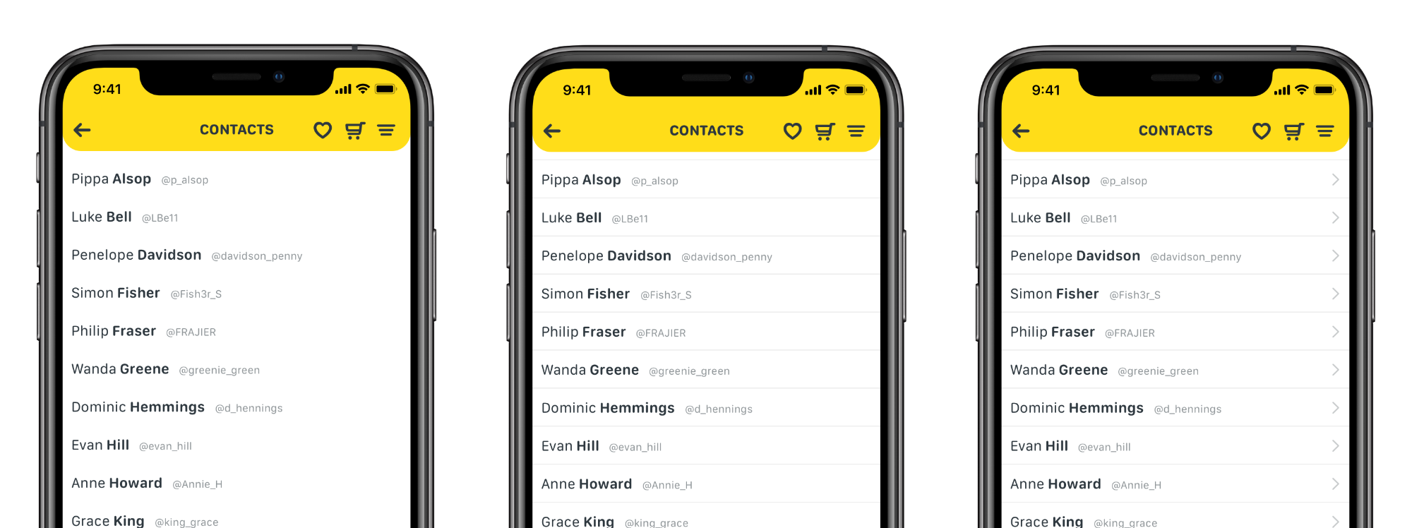
Here we have a list of names, but we want to show a user that they can select one to see more information. Initially people might assume that there are interactions hidden here and try to tap a name to see what happens, but we’d like the interaction to be more apparent. We could start by separating the names, so they appear as their own sections. This shows that they are more than just a vertical list, but still isn’t quite as concrete as we want to be. It still lacks a good signifier to show that each name affords tapping.
An easy way to show people there is definitely something beyond each of these names is to add a graphic or icon. Something subtle, but still easily readable. This is a pretty common way to show that adding subtle signifiers can lead to better discoverability and show users where the interactions are.
Obvious or Explicit Affordance.
This comes in the form of a button that is designed to look the way a physical button might look in the non-digital world, or through more direct signifiers like text that reads “click here”. Recently, digital design has moved away from this a bit and in more of a direction that guides the user into important interactions without being so blunt or holding their hand every step of the way. Some use of explicit affordance can be a good thing, like in a call to action, but it might be best to use this sparingly.

Hidden or Implicit Affordance.
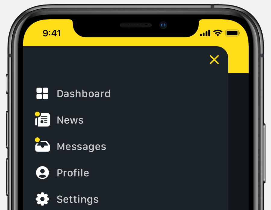
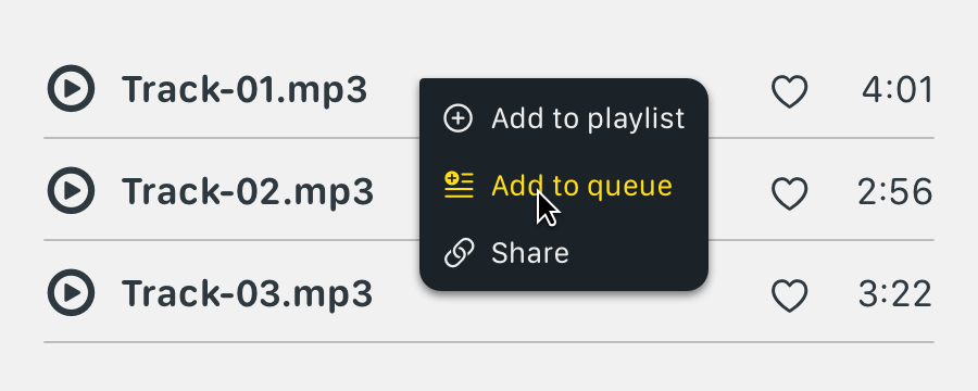
This is almost the opposite of explicit affordance. Interactions that use hidden or implicit affordance are usually not immediately visible to the user but become apparent after some initial exploration or interaction. They use fewer signifiers and come in the form of things like an action sheet on a mobile device, or maybe hover states on a button.
Hidden affordance can be effective in truncating content to simplify a design. An example might be a slide-out menu in a mobile app, or a list of actions that appears on a right-click with your mouse cursor. I wouldn’t say to avoid these types of actions, but maybe use them sparingly, or stick to instances where they might be expected.
Pattern Affordance.
This one comes is a lot of forms and has many signifiers. We’ve all probably seen a floppy disk icon to represent a save action, or a paper airplane icon to send an email. These are learned affordances and are kind of remnants of real-world items that have become conventions in digital design. A settings menu has never involved a physical gear as far as I know, but it’s the go-to icon to represent settings or tools in the digital world.
Another common pattern affordance signifier that we’ve all come to recognize is the notification badge. On icons and menu items everywhere. Usually accompanied by a number our other icon, but anymore, everyone is so familiar with this convention that just seeing a contrasting dot next to an icon is enough to drive users to click to see more.

Metaphorical Affordance.
A lot of pattern affordance blends into metaphorical affordance. These often use icons as signifiers like a paint bucket to represent a color picker, or a trash bin for a delete action, a shopping cart, gear, chain-link, cloud, or printer. We use signifiers rooted in real world objects or devices to help users understand what an action might be at a glance.
A lot of early smartphone interface design involved skeuomorphism to imitate real world object and textures to help teach users about interactions or functions. As users have become more familiar with common patterns and conventions in digital design, we’ve moved away from those styles and into flatter, simpler aesthetics.

Negative Affordance.
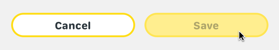
This is one that can be pretty powerful in directing a user to perform specific, intended tasks. One of the best ways to do this is using faded buttons to signify that there is an action, but maybe not yet. This one comes up a lot in places where a user might next to fill out information fields. A button at the bottom of their screen might read “Next” or “Save” but be faded out until they complete all of the intended actions elsewhere before the button pops into full color to communicate that they may move on.
This can be powerful in driving conversion. If you have a free and a premium version of a web app you might want to show users that other features or tools exist, but that they need to upgrade to use them. You can do this with negative affordance in the same way a faded-out button might work. You might show all of the tools in the same menu, but some are a more muted color than the rest, indicating to the user that they do not have access to this yet. You could still make them clickable, but direct the user to an upgrade screen where they might unlock more features within the app.
This can get tricky and drift into false affordance if not used carefully.
False Affordance.
Avoid false affordance. We don’t want to show a user something that looks like an interaction when it is not. This could come in the form of underlining words in a body of text. Many users will intuit this to mean that the underlined text is clickable as a link and might get confused when it is not. Try not to use common signifiers for things that are not meant to be interactions.
Other examples of this could be associating the wrong icon to a specific action, or a logo that doesn’t link to anything, or displaying text that looks like a button but has no user interaction.
The best designs keep things easy to find, easy to use, easy to understand, and enjoyable to the user.