Iconography: Tips to Create Effective Icons
Jensen Laatsch | April 8th, 2021

Icons, glyphs, images. All can be used to help convey messages and ideas, or to act as indicators or signifiers in a user interface. I’ll be going over tips to create a set of icons specifically for use on screens.
Simplicity and Clarity
Icons are meant to be immediately understood by the user, ideally without the use of supporting text. They’re meant to be language agnostic, simple and clear to the user. These will often be displayed at small sizes to users, so keeping them readable when scaled down is a must - simplicity in your design will aid in readability.

This truck is an example of something that is not really an icon because it’s too busy and detailed. It’s more of an illustration. Avoid making icons too detailed, because as they get smaller, you’ll lose all that detail and the image will become less readable.
Let’s take that first truck I made and look at a few ways we can simplify it into a usable icon.
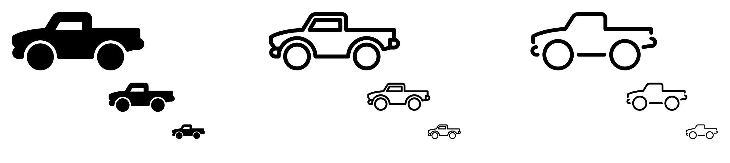
In the first one we keep the overall silhouette but fill it in completely and separate the wheels from the main body. The second one takes a similar shape but turns it into more of a line drawing. The last one is the most minimal of all the versions. The wheel wells are gone and traded instead for gaps in the lines to separate the different parts of the whole. All these options can be resized to be very small and still remain readable. When creating icons, play with iterations like this to hone-in on a style that you like and one that would also stay understandable to the user.
Use Exact Pixels (When You Can)
Be sure you are fitting your design into exact pixels whenever possible – this will ensure each icon you design looks crisp and clean across many devices. Most current design apps support some version of pixel-snapping, so try this out for the best possible display to the end user. This becomes a little more important when dealing with older devices like tablets and phones that do not offer high density screens. Lining things up as close to pixel perfect will provide the sharpest looking result.

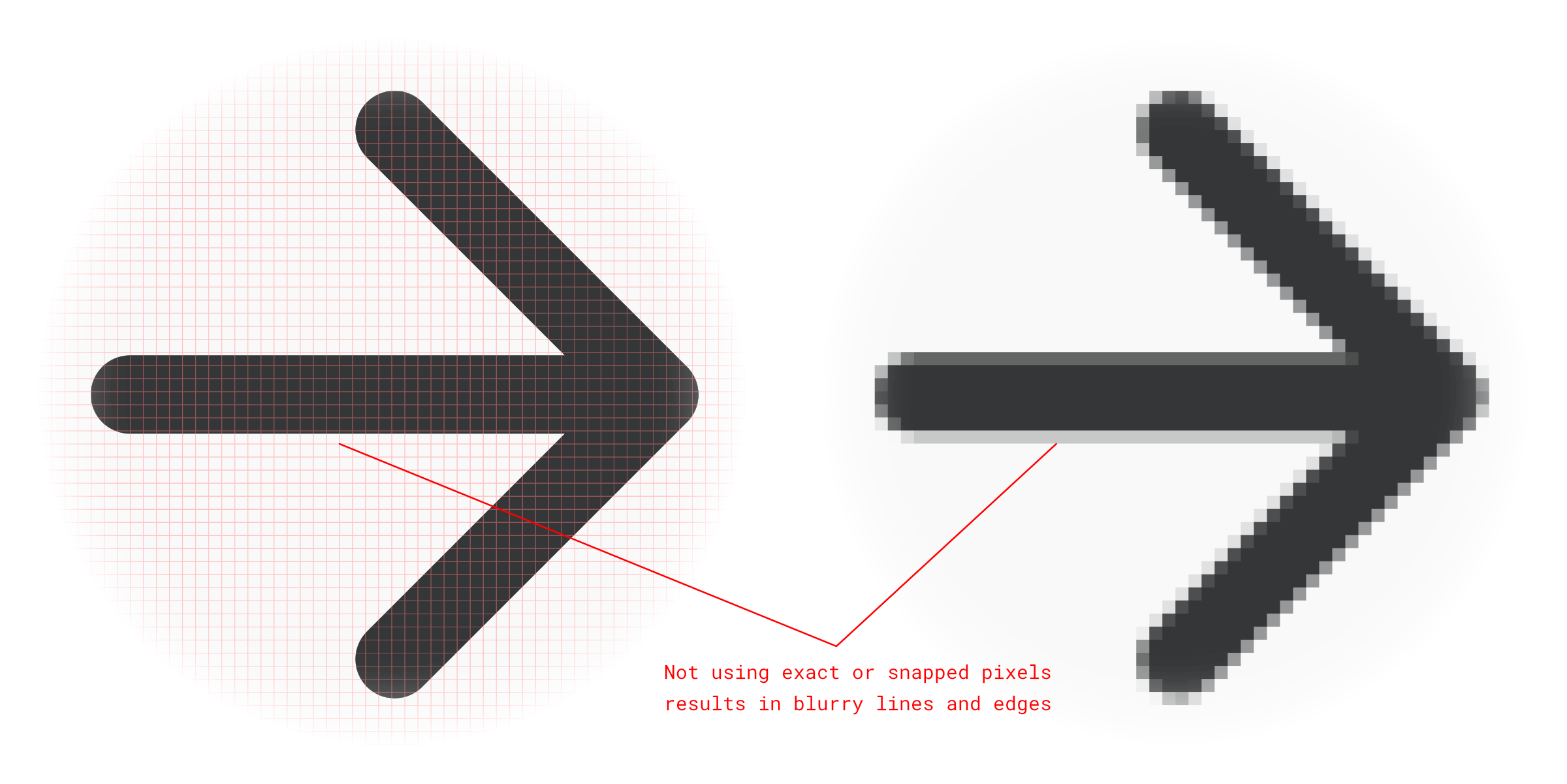
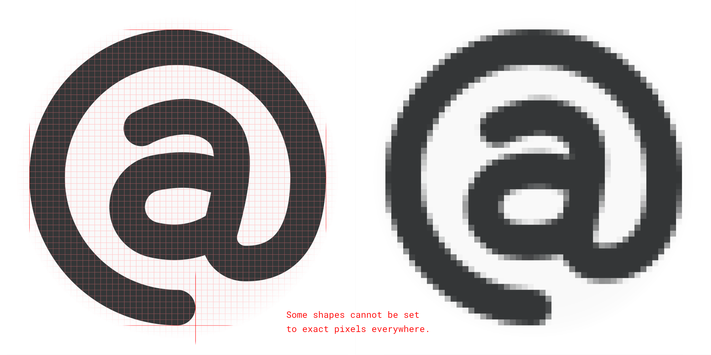
Use your best judgement because this might not be possible with all shapes. For instance, diagonal lines and rounded shapes won’t fit precisely on a pixel. Use exact or snapped pixels where you can.
Develop a Consistent Style
This is one of the best tips I can provide for making a good icon kit. Find a style that fits the project and run with it. Find and develop through-lines in your icons. Repetition, in this case, is a good thing. It can be the same uniform corner roundness, line weight, colors, anything. All the shapes should be consistent and look like they belong next to each other. This can also tie into the branding of the project and help build brand awareness when the main logo is not present.
You can start with a few of the simpler shapes and work your way out from there. I like to start with arrow icons to kind of set the tone for the overall lines of the icons. Many projects need these kinds of icons so it’s usually a safe place to start.
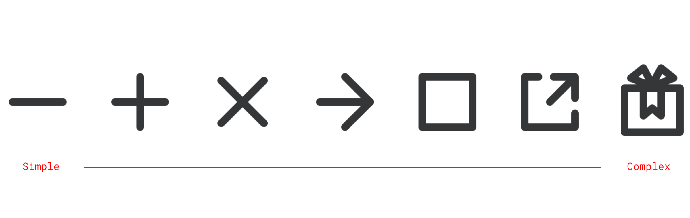
Be sure to make everything at a uniform size. They don’t have to be the same size, but they should look like they belong together.
Draw Inspiration From Real Life Objects
People will better understand your icons if they represent known shapes or objects found in the real world. These are metaphors. Metaphors can be incredibly useful to help communicate an action or function of a tool in a quick and easy way. We see this in the form of a bell icon to represent a notification, or a bit of chain to represent a link on the web. If you need a specific icon, check around the web for images of a possible real-world counterpart and see if you can draw inspiration from those shapes.
Include Padding In Your Icons
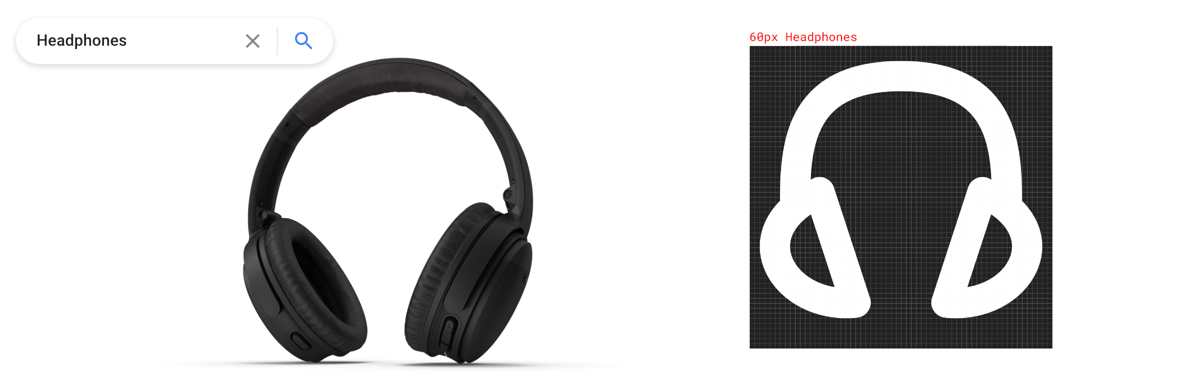
Icons are all going to be different shapes and sizes. Make sure that you are creating them with the export in mind. Always include the padding in the final cuts to make sure they can be interchangeable without any distortion. In my example, you will see all of the icons have been placed on a 60-pixel grid, then their center mass was placed visually toward the middle of the artboard. In this case, you would export the whole artboard or frame, making the final result a uniform, square image for every icon. This means that they can be sent to development or off to a client knowing that they can all be used interchangeably without any headaches.

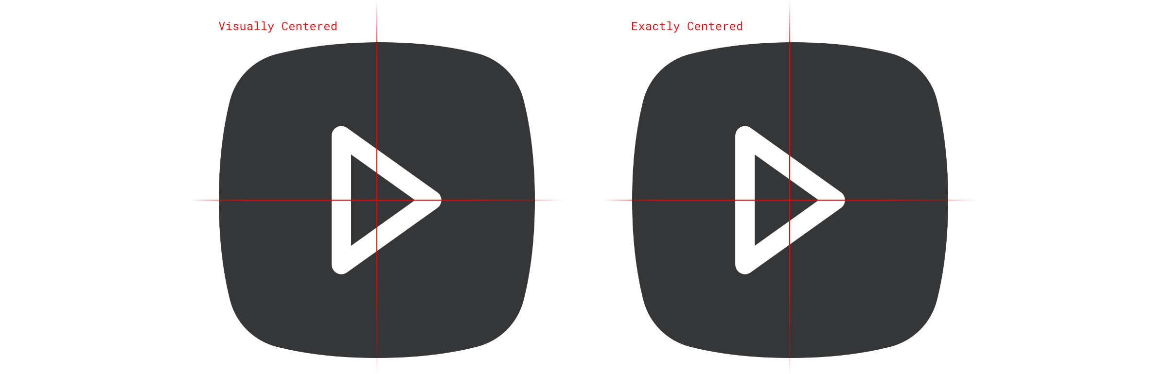
Make sure your icons look centered to the human eye. Some images, when placed in the exact center of the grid will not always look correct to a viewer. Make sure you are placing the center mass of your icon nearest the center of your grid so that it looks the best to you. Eyeball it and try exporting different versions to make sure you’re getting the best visual result.
Resources to Get You Started
Most of the icons used in this article, plus many more, are included in my Sketch starter kit. Can’t use Sketch? This link also contains folders where you can find the whole icon set as separate .png and .svg files. Ready to be used in your preferred design tool.
https://drive.google.com/drive/folders/11OGucrwMVXUynK0zeieZJZ9XqeVGXbsl
Take this project that I’ve started in Sketch and use it to create your own icons or use it as inspiration to start a completely new icon project. Inside you’ll find vector line drawings for all included icons, as well as all icons converted to outlines and ready to be exported.
Other great resources:
These are some of my favorite icon libraries, and all offer great starter icon packages.
- FontAwesome - fontawesome.com
- Google Fonts Icons (Formerly Material Design)- https://fonts.google.com/icons
- Apple SF Symbols - https://developer.apple.com/design/human-interface-guidelines/sf-symbols/overview/
- The Noun Project - https://thenounproject.com/
- Feather Icons - https://feathericons.com/
- Streamline Icons - https://streamlineicons.com/
Last, check out my post about Signifiers and Affordance to see some ways you can use the icons you’ve made.