The Value of the UX Review
Jessica Esplin | September 27th, 2021
What is a UX review
A main motivator in my transition from graphic design to UX was the idea that my design decisions in the UX space would be more informed, ultimately leading to a higher quality product. I loved the idea of putting out a fully researched product, seeing how users reacted, and then coming back and making updates. In my ignorance, I thought that a designer does their work, then a developer codes it, and then users interact with it. Obviously, there are plenty of steps missing there, one of which is the incredibly vital “UX review.” It doesn’t matter how beautiful and intuitive your designs are if they don’t get programmed correctly.
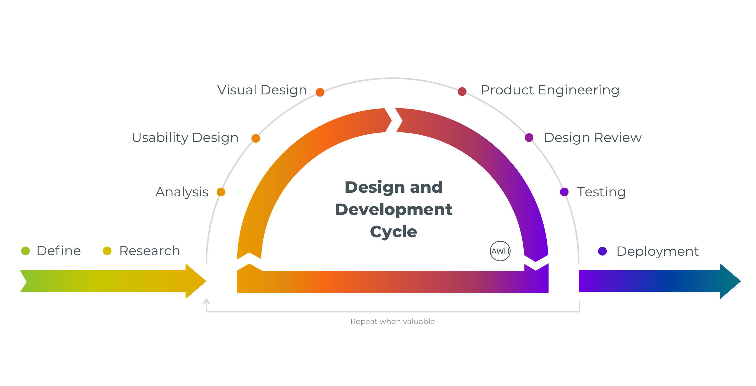
When I first started at my current company, key features that had been developed would go through a UX review process. Since then, we’ve all realized how essential this step is and now, any task for a developer that has a UI element to it must go through a UX review before it can be marked as complete. Below is a graphic that I created a few years ago to demonstrate our current product journey showing “Design Review” as an integral step.
So, what is a UX review? Basically, this is a time for the designer and developer to come together and make sure that what has been coded matches the designs that were given. Since we moved fully remote, this is typically a quick video chat with the developer sharing their screen and walking through what they’ve created and then taking notes from designer feedback as to what needs to be changed.
Why it needs to be happening
I’ve worked closely with quite a few developers in my design career and unsurprisingly, there is quite a range of UI skill. For the most part, front-end programmers do a great job of looking at designs and matching the code to it. Often, I’ll begin a UX review and the screens look almost perfect, with maybe a few padding issues and an incorrect font size. However, there are definitely some people that write great code, but don’t have an eye for pixel-perfect design. We’ll get into a review, and I have to figure out how to tell them that ten things need to be updated.
It may seem picky and inefficient. Obviously, the designer notices a difference, but would a user really be able to tell? Well, if a designer is truly making informed design choices based on user experience principles, then yes, it does matter. Little UI discrepancies add up when you’re dealing with a complex system. Let’s look at a quick example.
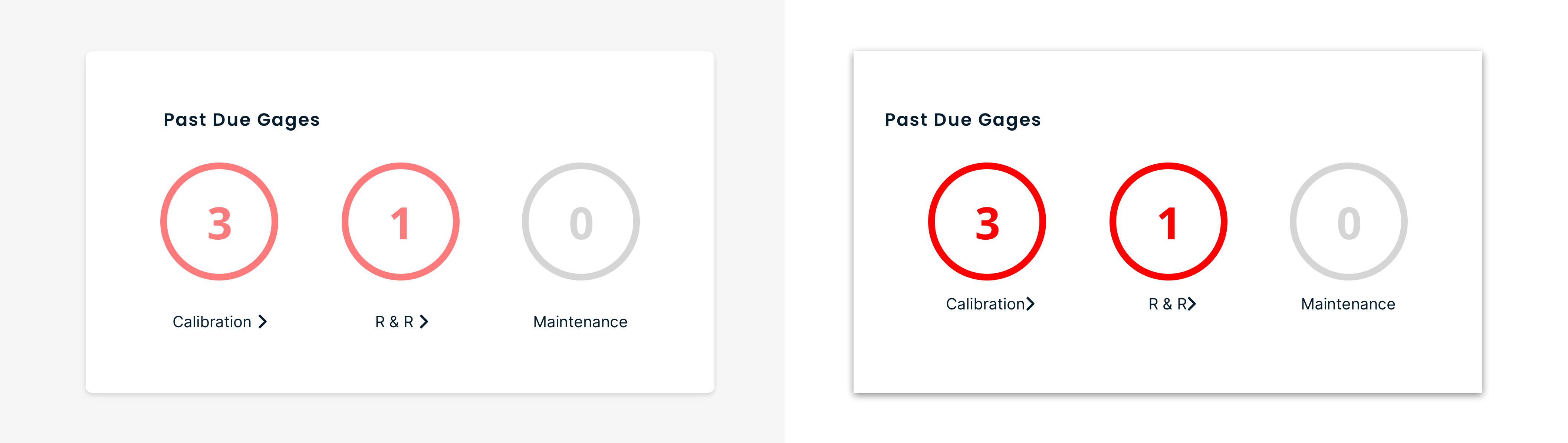
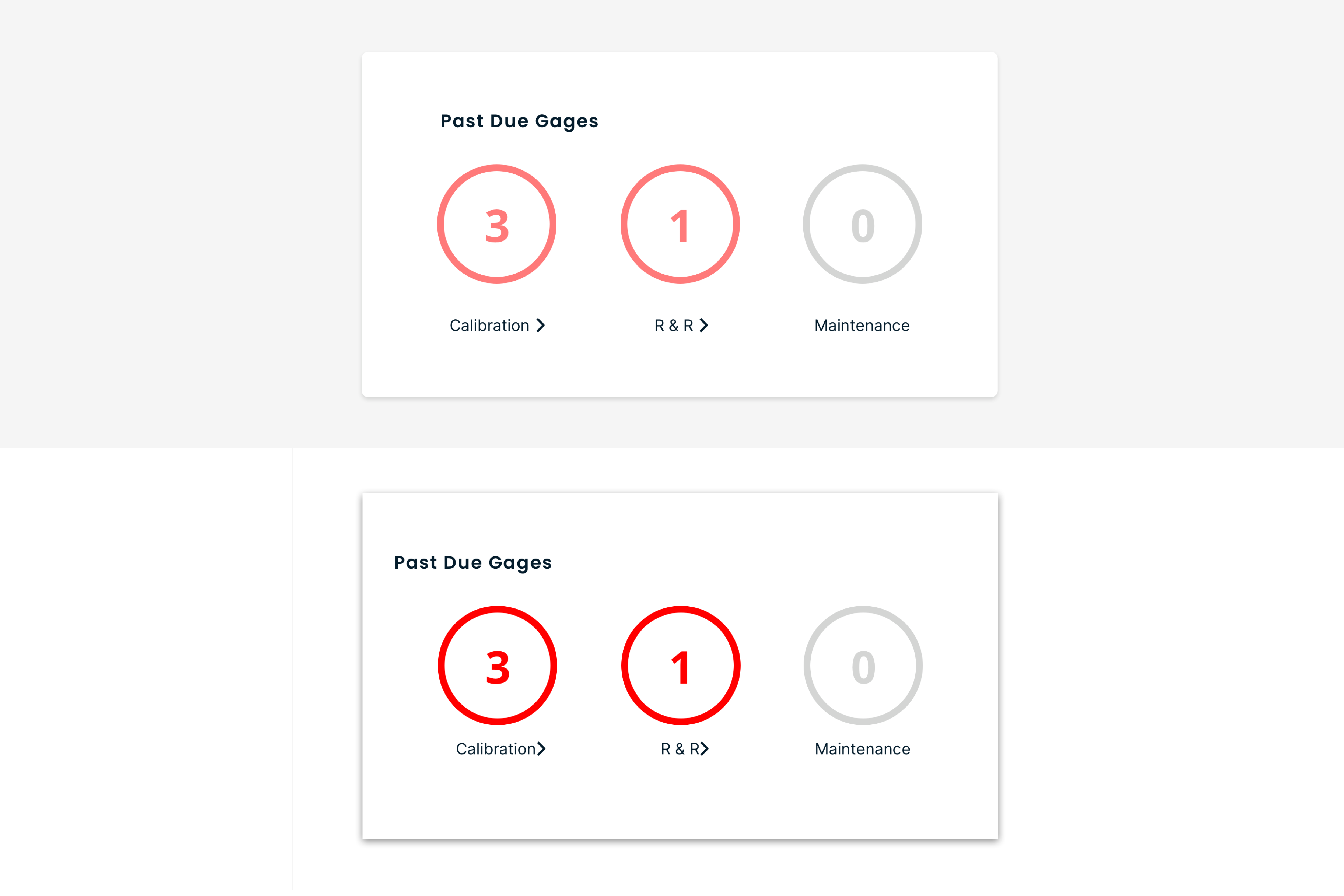
On the left is the high-fidelity mockup that I gave the development team, on the right is what the developer coded and presented during the UX review. They look pretty similar, and a project manager might say, “looks good, let’s keep moving!” But there are some common UI misses with the image the developer coded that need to be addressed during a UX review.
- The background color is incorrect. The correct background color is a light gray that may look almost white but decidedly isn’t and was chosen for a reason.
- The corners of the card don’t have the slight rounding like they are in the mockup that was provided, making it look harsh.
- The shadow on the card is too intense.
- The card title is too far to the left and not aligned with the visuals below it.
- The red is a system default red as opposed to the branded, and much more visually appealing, red.
- There isn’t enough white space in between the circles and the labels below them.
- There isn’t enough space between the label (ex: Calibration) and the arrow.
This may all seem minor, but it begins to add up when everything is listed out. This is the job of the designer to notice and push back on, even if there are only one or two minor issues present.
To minimize the instances of UI issues, we use a product called InVision that allows developers to “inspect” designs and get exact hex values, font styles, padding, etc as shown below.
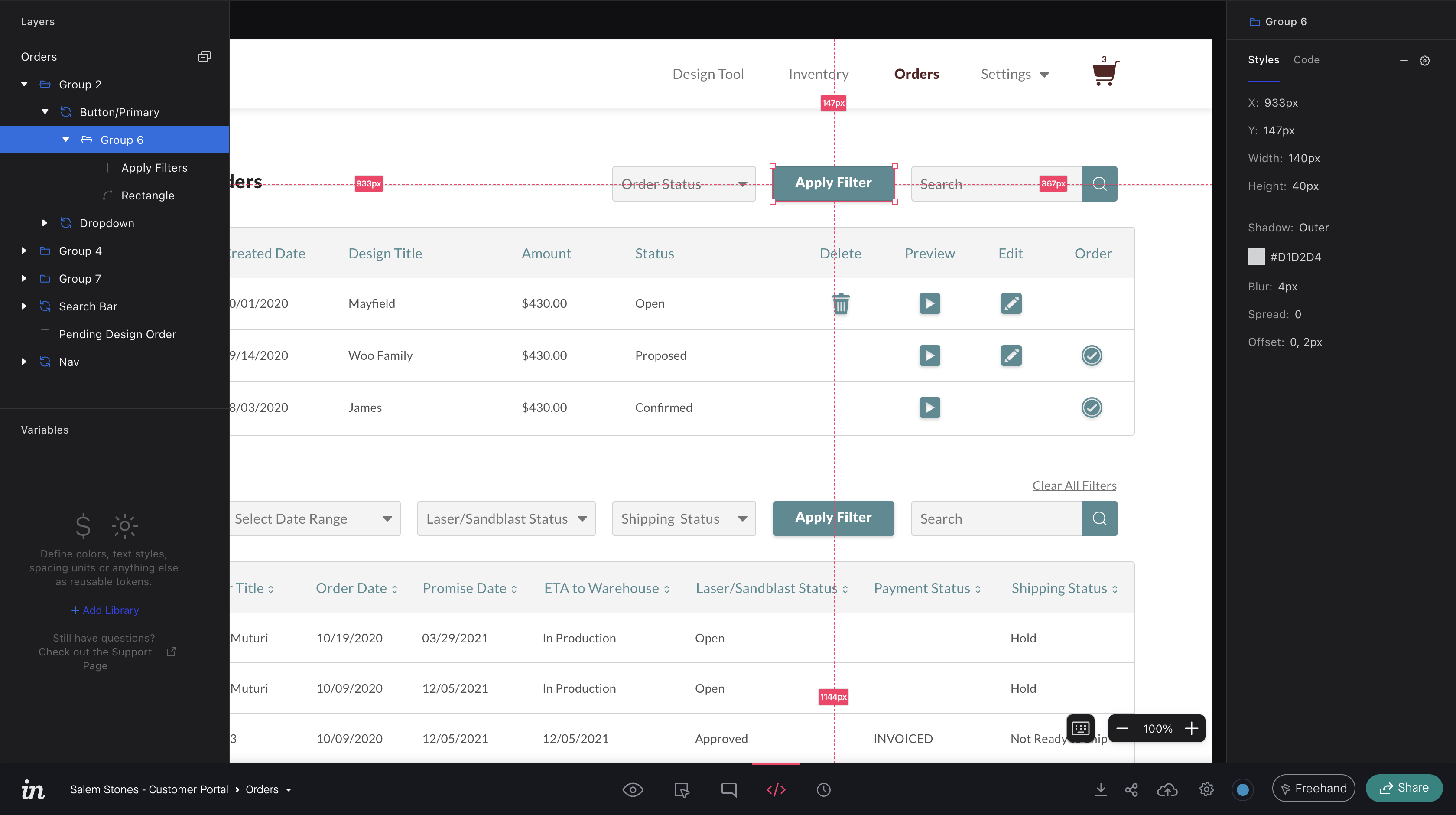
This helps quite a bit, but there are still always issues that need to be addressed and updated in the UX reviews I have been a part of.
The extra time is worth it
Being part of a consultancy, I’ve worked on my fair share of projects with looming deadlines and quick turn-around times. The kind of projects where designs always need to be finished last week and development should have started yesterday. It’s easy in these situations to let things slip through the cracks, especially UX reviews. We don’t allow this to happen. A user may not notice specifically that the page titles are all in slightly different locations and that the body text has varying line heights, but they will intuitively feel like that the system, in its entirety, isn’t polished. They may not be able to put their finger on it, but it’s an issue that often causes a confusing experience.
Less than thorough design reviews may have much larger implications as well. An important part of the UX review is testing breakpoints. Sure, it looks great on a desktop, but how does it look on a tablet? Maybe the requirements don’t mention making a screen responsive, so a developer doesn’t take the time to do that. This is not uncommon. See below for a very real possibility.
Left is a desktop view that was approved, and right is how it looks on a tablet because the designer forgot to ask how the code looks with different breakpoints.
If you’re a designer, hopefully your place of work sees the value of good UX and doesn’t need much convincing to implement UX reviews. They’re a key part of our workflow and ensure that screens are developed correctly before going into production. If you’re currently not able to regularly do UX reviews, it would be in your best interest, and the interest of your users, to fight for them!